You can like a siding sample in your hand and still hate it once it covers the whole front elevation. That is exactly why a siding color visualizer for house planning has become so useful for homeowners who want curb appeal without second-guessing every shade. When you can preview siding with your roofline, shutters, stone accents, and trim, the decision gets a lot more practical.
For homes in northwest Ohio, color is not just a style choice. It affects how your house looks under bright summer sun, cloudy winter skies, wet spring conditions, and the muted backdrop that comes after leaves drop. A color that feels warm and balanced in a showroom can read flat, too yellow, or overly dark once it is installed outdoors.
What a siding color visualizer for house projects actually helps you do
A visualizer is not magic, and it is not a perfect substitute for real product samples. What it does well is help you narrow the field before installation starts. Instead of guessing between six similar shades of gray or beige, you can quickly see which colors work with your existing roof, windows, and architectural lines.
That matters more than many homeowners expect. On a ranch home, a wide expanse of siding can make some colors feel larger and more dominant than they looked on a swatch. On a two-story colonial, the same tone may appear more balanced because trim, shutters, and roof proportion break up the wall space. A good visualizer gives you a full-house perspective, not just a paint-chip impression.
It also helps with coordination. If you are keeping your roof and replacing only the siding, the right color needs to bridge what you already have with the updated look you want. The same goes for brick foundations, porch columns, soffit, fascia, and gutters. A visualizer lets you test combinations before those choices become permanent.
Why color looks different on your home than it does in a brochure
Most homeowners are not struggling to choose a color because they lack taste. They are struggling because exterior color is affected by scale, light, texture, and surrounding materials.
Vinyl siding has shadow lines, panel texture, and profile depth. Those details change how color reads from the street. A soft gray can look crisp on smooth renderings but pick up blue undertones outside. A tan can look classic at noon and noticeably gold near sunset. Darker colors can look rich and sharp on some homes, but on others they may make the house feel visually heavy, especially if the roof is already dark.
Ohio weather adds another layer. Cloud cover softens contrast. Snow can make mid-tone siding appear darker. Wet conditions can deepen the look of nearby brick, roofing, and landscaping. That is why visualizers are most helpful when you use them as a decision tool, not as a final promise of exact color.
How to use a house siding color visualizer without getting misled
The best approach is to start broad and then get specific. First, choose a color family that fits the style of your home. Traditional homes often work well with balanced neutrals like clay, linen, almond, and soft gray. More modern exteriors can carry deeper contrasts like charcoal with bright white trim. Farmhouse-inspired homes usually look strongest when the siding, trim, and accent colors are clean and restrained rather than busy.
After that, look at your fixed elements. Your roof, masonry, front door, and any permanent stonework should guide the direction. If your roof has warm brown undertones, a cool blue-gray siding may fight it. If your home has red brick, certain beige and greige tones will feel more natural than icy gray.
Then test trim combinations. Many homeowners focus on the main siding color and leave trim for later, but trim can completely change the result. White trim creates contrast and a sharper outline. Cream trim softens the look. A darker trim can feel current on the right home, but it can also make windows look smaller if the contrast is too low.
One smart way to use a visualizer is to eliminate rather than select. You may not land on the final answer immediately, but you can identify what definitely does not work. That alone saves time and prevents expensive hesitation once a project is underway.
The most common color mistakes homeowners make
The first mistake is choosing from trends alone. A color may be popular online and still be wrong for your lot, your roof, and your neighborhood context. Homes in established areas often look best when they feel updated but still grounded in the character of the street.
The second mistake is going too dark without considering proportion. Deeper siding colors can look great, but they are less forgiving if your home has limited trim contrast or a complicated roofline. They can also emphasize uneven lines on older exteriors that lighter tones tend to soften.
The third mistake is overcomplicating the palette. Siding, trim, shutters, door color, stone veneer, and roofing all compete for attention. If each element demands focus, the home can feel disjointed. Usually, the strongest exterior has one dominant siding color, one supportive trim color, and one accent color used with restraint.
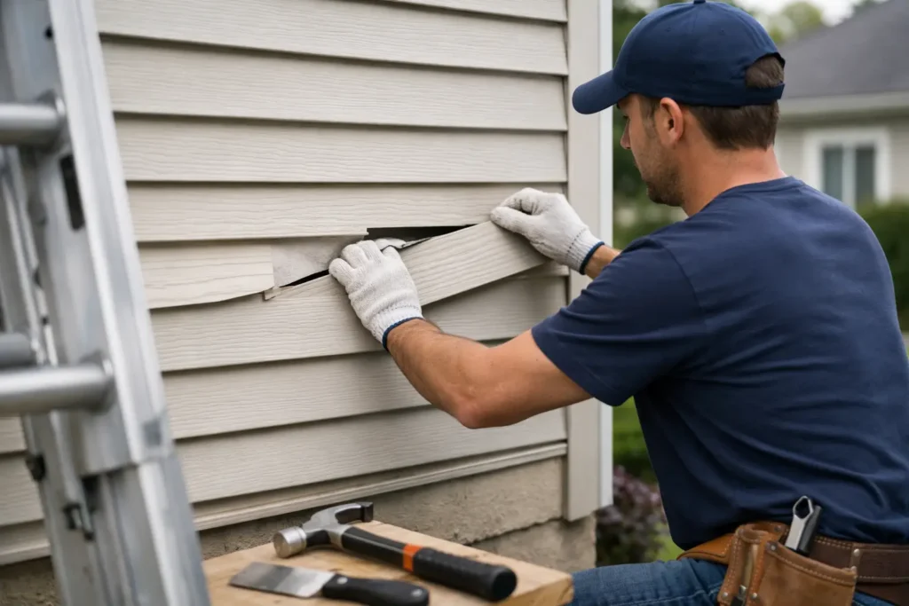
Another common issue is forgetting repair and color matching needs. If you are replacing only part of the siding or blending new work with an existing section, a visualizer can point you in the right direction, but exact field matching still takes experience. Screen previews help with design. Real-world matching depends on product availability, weathering, and how long the original siding has been exposed.
Best color directions for Ohio homes
There is no single best siding color, but some directions consistently perform well on homes in this region. Mid-tone neutrals tend to age well visually and pair easily with common roof colors. Greige, soft taupe, light gray, muted sage, and warm beige often hold up well across changing seasons and different lighting conditions.
Crisp white can look excellent, especially on homes with dark shutters or black accents, but it shows contrast sharply and can feel stark if the rest of the exterior is not equally clean and updated. Deep blue and dark gray can be strong choices when the architecture supports them, though they need careful coordination with trim and roofing to avoid a heavy look.
Earthy tones remain dependable because they sit naturally against Ohio landscapes. They also tend to complement brick, stone, and older neighborhood character better than cooler, trend-driven colors that may feel dated sooner.
For homeowners in places like Lima, Findlay, Elida, and Shawnee Township, the practical question is not what color is most popular. It is what color will still look right after a cloudy March, a humid July, and a long winter of road salt, slush, and bare trees.
Where a visualizer helps and where real expertise still matters
A visualizer is excellent for seeing possibilities. It helps you compare combinations, avoid obvious clashes, and build confidence before work begins. It is especially useful if you are deciding between full replacement and a more targeted exterior update.
But some decisions still benefit from experienced guidance. If your home has fading, patch repairs, mixed materials, or older additions, digital previews may not capture the whole picture. The same goes for homes with unusual roof colors or partial brick facades. What looks balanced on a screen can shift once real materials, shadow lines, and lot orientation come into play.
That is where a contractor who works with vinyl siding every day brings value. Ohio Vinyl Siding Guru, for example, approaches color as part of the full exterior system, not as an isolated design choice. That means looking at the age of the home, the condition of surrounding materials, the profile of the siding, and how the final combination will perform visually over time.
A better way to make the final choice
Use the visualizer first to narrow your options to two or three realistic combinations. Then compare those choices against actual samples outdoors, next to your roofline, trim, and masonry if possible. Look at them in morning light, afternoon light, and on an overcast day. If one color only looks good under perfect conditions, it probably is not the right choice.
Give extra attention to the front elevation because that is where contrast, symmetry, and curb appeal matter most. Also step back from the house. Colors that feel subtle from two feet away may feel much stronger from the street.
The best siding color decision usually feels less exciting than homeowners expect. It is not always the boldest or newest option. More often, it is the color that makes the whole house look cleaner, more balanced, and more intentional the moment you pull into the driveway.
If a visualizer helps you get to that point before a single panel goes up, it has done its job well. The right choice is the one that still feels right in real weather, on your real home, long after the screen is off.